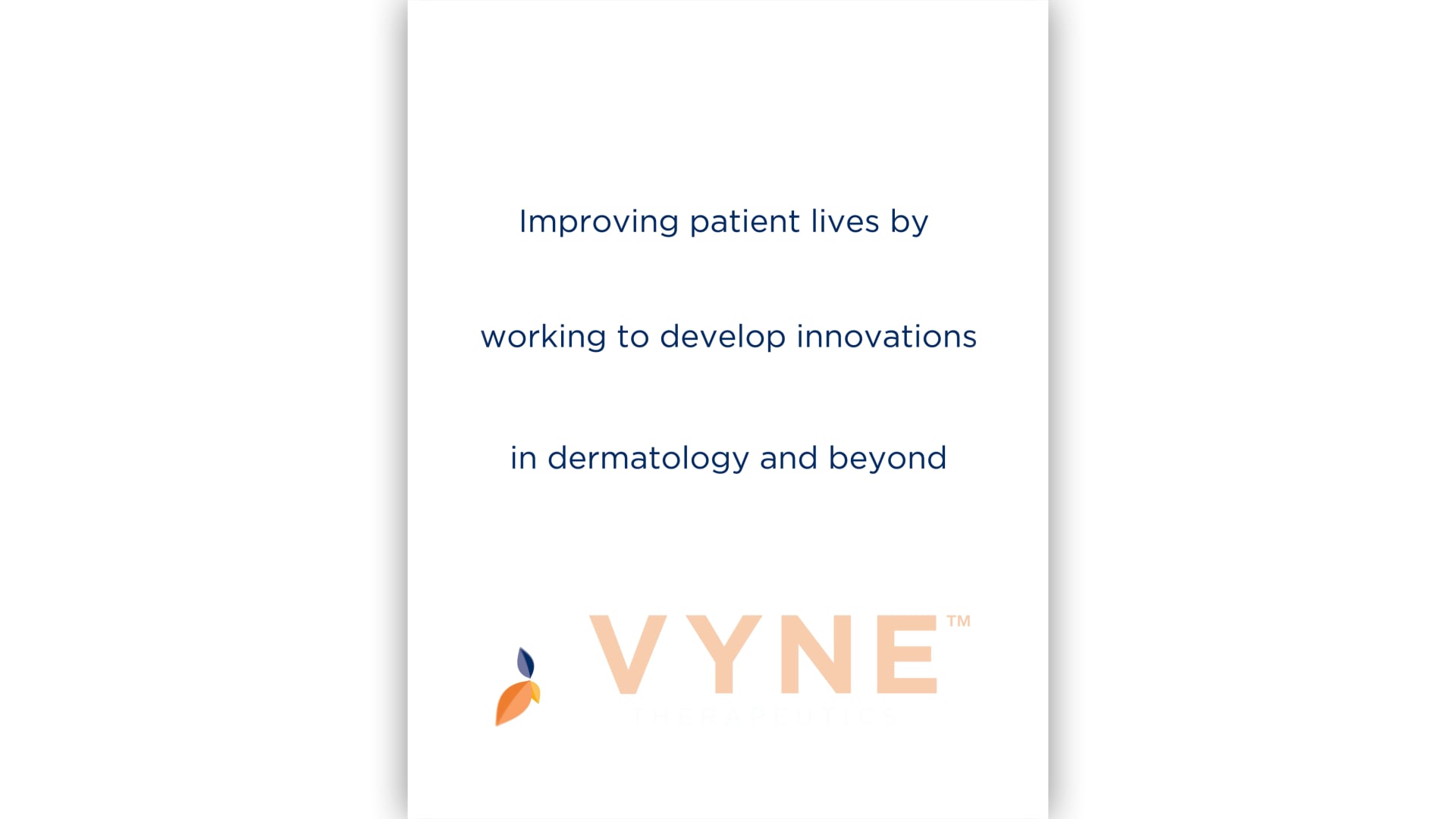
VYNE THERAPEUTICS
The following Brand Development was involving the merger of two companies. We were presented the new Name and Task from the client with the key outlook being continued growth. This New Branding didn’t just have to reflect the desire for fiscal growth as a company, but it also had to represent the need to grow trust for new products that address old problems. The name was derived from the word vine, and 3 key words that immediately came to mind after our initial inquiry were Growth, Strength & Resilience. We created the positioning “ROOTED IN INNOVATION” addressing the company‘s innovative approach and our graphic solution to compliment this positioning is a Bold typeface that contrasts with the natural, elegant curves of vine leaves in the icon. The VYNE Leaf Icon represents VYNE‘s pillars of success: INTEGRITY, INGENUITY, INNOVATION, GROWTH. The thought behind this symbol was to incorporate the vine leaves to visually help re-enforce the meaning of the core pillars. While further exploring the brand and developing the website we expanded the core strategies ensuring a consistency through both visuals and messaging.
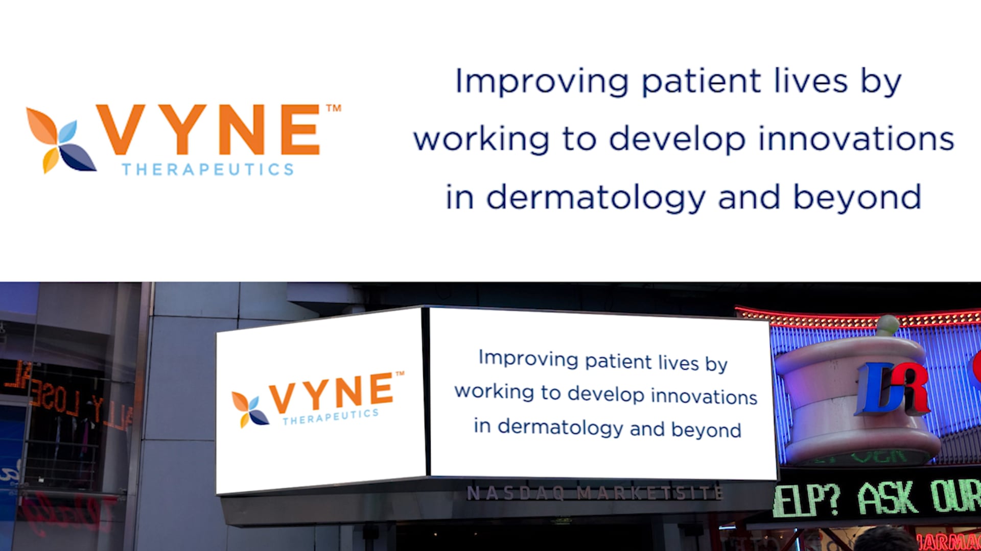
Public Offering NASDAQ Opening
VYNE Therapeutics had the privilege to open the trading day on Wall street when they officially went public. As a part of that VYNE was able to advertise on the NASDAQ billboards in time square. We were able to put together two billboard spots to highlight the newly public company.